Why use colour to build your brand recognition?
In this constantly changing world it’s vital for your brand to stand out, attract your ideal clients and gain their trust and loyalty.
We know that buying decisions are primarily emotional. And this is why we need to harness the branding tools that grow emotional bonds with your clients.
These emotional bonds are built on your brand purpose, values and personality. So this is why it is important to make good choices on how to represent your brand.
Your brand logo, brand style, typography, how you use imagery and your tone of voice are all important representations of your brand. They really matter – and one of the most important branding elements that creates emotional connections with clients is your brand colours.
Here are 5 ways you can use colour to build brand awareness and recognition:
- In your Brand Logo
- Throughout your Brand Messaging
- With your Brand Packaging
- As part of your Product Specification
- To segment your Range Architecture
Why colour matters in your branding
Colour creates coherence and consistency in your brand communications. It’s also a major factor in attracting your ideal clients. Check out these numbers, which confirm the power of colour:
- It takes someone 90 seconds to form an opinion about your business
- Research shows that over 60% of that opinion is based on colour alone
- Colour increases brand recognition by 80%
How the Power of Colour works
- By Association – associating colours with emotions or responses could be very personal. For example, you may love the colour red because you get compliments every time you wear it. Or you may dislike the colour purple because you hated wearing your purple school blazer.
- Symbolism – Colours carry cultural symbolism too – like lucky shamrock green in Ireland or lucky red which symbolises abundance in China.
- Psychology – the psychology of colours is based on our unconscious responses to colours. For example, blue is one of the most popular colours worldwide because it taps into feelings evoked by sea and sky.
- Physical effect – lastly, some colours may even have a physical effect on our bodies. For example, yellow can be physically stimulating and can aid creativity.
Let’s look at 5 ways to use colour to build your brand over time
1. Brand logo
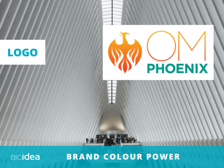
Om Phoenix is a new force in training, bringing culture change and mindfulness to the corporate world.
Golden orange and teal were chosen as core brand colours for the Om Phoenix brand because of their specific spiritual significance.
In addition, orange and teal support the brand positioning with their joyful, exuberant and healing qualities.
2. Brand messaging
Colour is a highly effective tool for brand messaging.
- You can use colour to build brand awareness with consistent use of brand colours. This is why it’s important to have a core brand colour palette, supplemented with secondary colours.
- Secondary colours could have specific roles. For example, you could use a contrasting secondary colour for all the ‘call to action’ buttons on the website.
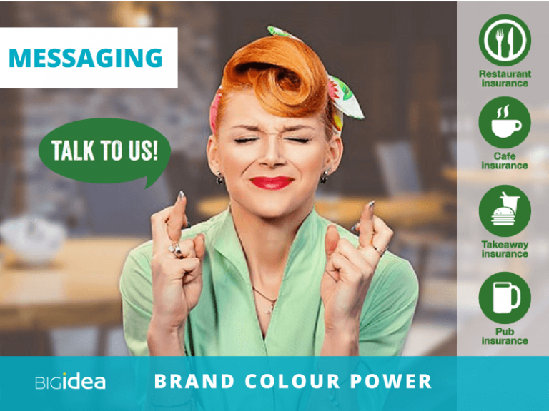
- This example shows how Coversure Wimbledon use their green core brand colour in icons, to get attention for their restaurant and food sector specific insurance policies.
Using your brand colours consistently throughout your brand messaging maintains a cohesive brand image and over time, builds brand recognition and memorability.
3. Brand packaging
Get your brand seen, recognised and remembered with boxes, bags and labels decorated in your brand colours. These examples demonstrate how you can use colour to build your brand visibility.
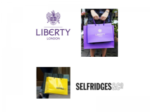
- Carrier Bags – The sunshine yellow bags of Selfridges are a great example of brand colour creating visibility. These carrier bags can be seen from afar on london streets and in the tube. We’ve even heard stories that the Selfridges’ yellow bags are now covetable objects of desire in their own right.
- Boxes – Likewise, Tiffany has created boxes of desire for their luxury products. Those gorgeous, distinctive Tiffany-blue boxes wrapped in white ribbon are treasured and kept alongside their contents. Cartier also demonstrate the value of developing a signature brand colour that is instantly recognised. Cartier red represents the richness, opulence and heritage of the ‘jeweller of kings’.
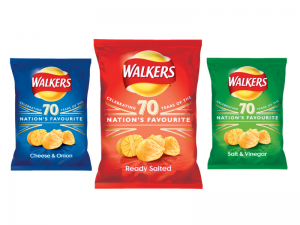
- Packs – Meanwhile in the food sector, Walkers provides an example of sector colour codes. In the UK, red is the pack colour of ready-salted crisps. These sector colour codes help customers make a fast and easy selection. And these established colour codes make it harder for new competitors to use a different colour code. Or, if you like, they make it easier to focus creativity.

4. Products
Colour plays an important part of product development.
Food
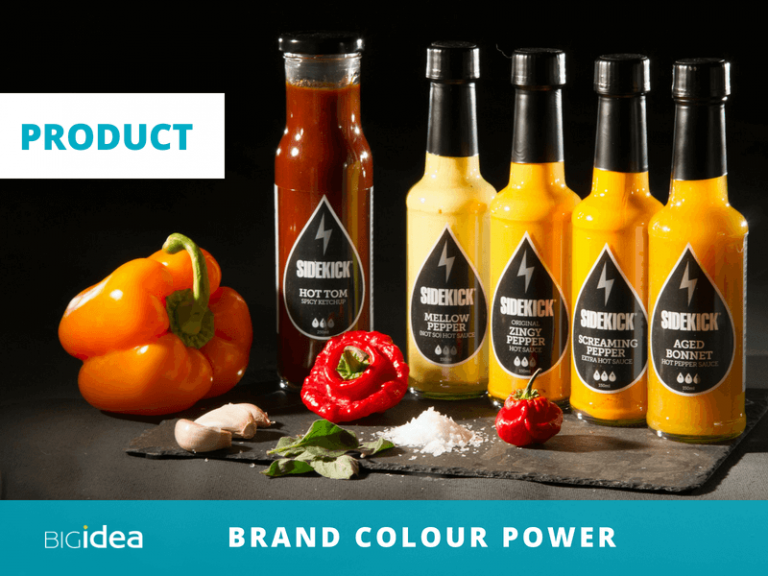
In this example Sidekick Sauce uses yellow, orange and red colours to signify the relative heat or mildness of individual sauces. This shows how the appropriate colours create appetite appeal in food products.
5. Brand Architecture
You can use colour to build your brand architecture – and therefore help clients navigate your range of products and services more easily.
In some market categories there are long-established colours for product groups, so it makes sense to use these. For example, when marketing paint, (many years ago), we used the convention of Matt finish = blue and Silk finish = green.
In this example, Neil Ben uses colour to segment his services for training companies and charities.

In summary
There is tremendous potential to use colour to build your brand in each of these five ways. The key is to be consistent and to develop a coherent method of using your brand colours.
Always take into account:
- The power of colour
- The needs of your customers and
- The ‘rules’ of the market sector
There’s a lot more to brand colour than meets the eye, so please do get in touch here if you’d like to discover more about building your brand with colour. And please do sign up for our monthly email, Branding Matters with tips to help you build a powerful brand. Simply sign up here.
Want a standout, human-centred brand?
1. Let's talk
Being human, starts with a coffee. Together we'll clarify what your brand needs, how long the work will take, and the fees...
2. Reshape your brand
Using my 3-step Brand Affinity™ process, your brand looks and feels authentic, with a distinctive identity and value-based messaging...
3. Get noticed
With your standout brand, you can increase your impact, grow your business and make a difference that matters for your clients...

