Colour meaning
How two different brands use the same colours to convey their intentions
The sports news is dominated every July by the Grand Slam Championship organised by the All England Lawn Tennis & Croquet Club (AELTC). Like many, I watch the Wimbledon highlights and follow the stories of the players – from their triumphs and excitement to their disappointments and despair.
You can’t get away from brands at Wimbledon. You’ll see Rolex keeping time, Evian bottles, Slazenger balls and in 2023, the Barclays sponsorship logo. (This has generated controversy and claims of sportswashing, because Barclays are big lenders to oil and gas).
You’ll also see lots of well-known sports brand logos on players’ clothes, hats, bags and rackets.
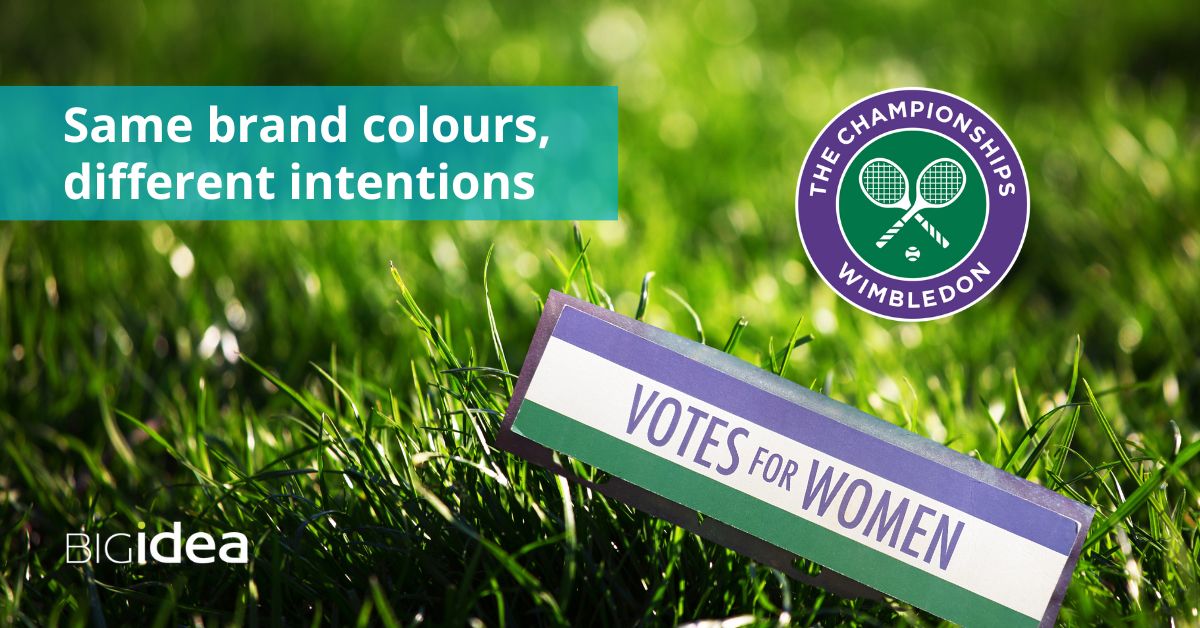
I’m intrigued by the fact that Wimbledon shares its brand colours of purple, green and white with the suffragettes. They share the same colours, and draw on the same roots of colour meaning, yet with different intentions.
Let’s start with purple
What do we know about the meaning of the colour purple – and why is it a good choice for Wimbledon?
On the Wimbledon website it says “The present colours — dark green and purple — were introduced in 1909 following the discovery that the previous Club colours of blue, yellow, red and green were almost identical to those of the Royal Marines. The decision as to why dark green and purple were chosen is not stated in the Club’s records.”
Purple was once the most expensive colour in Europe, painstakingly created from the crushed shells of sea snails. The sea snails died so that Roman emperors, royalty and bishops could display their otherness, wealth and pomp.
Purple became affordable and hugely popular after the accidental discovery of synthetic purple dye by the young chemist William Henry Perkin in 1856. It was called mauve and said to be Queen Victoria’s favourite colour. She spent many years mourning the loss of her husband Albert, and this is why mauve was also associated with mourning for a time.
Purple is still associated with luxury, along with creativity and imagination. So you can see why it makes sense to include purple in the colour palette of the most exclusive, top tennis club in England.
So, why did Mrs Pankhurst choose purple?
It’s said that she consciously chose purple to represent the dignity and regality of women – along with loyalty and courage in the cause. So here, her choice of purple is aligned with the heritage of purple and how it was worn by royalty!
Save
Save
Save
Save
Save
Save
Save
Save
Save
Save
Next, let’s take a look at the meaning of green
The choice of green for Wimbledon seems obvious – it’s the colour of grass – perfect for the top lawn tennis tournament
Green is the colour of nature and is used by many eco brands and healthcare brands. They tap into the vitality of green, as well as its sense of balance and calm.
Green is also the colour of money. In astrology, green belongs to Venus, the planet that rules abundance in all its forms. Hence Venus rules love (green is the colour of the heart chakra), food and money. So it follows that the world’s leading currency – the dollar – has green bills.
The Wimbledon brand colour is a deep rich green that evokes stability and heritage. It also works beautifully with the luxury feel of their brand purple. It’s also worth remembering that there’s a lot of money at stake in every Wimbledon tournament. Money matters not just for players and sponsors – but also to generate funds for grassroots British tennis.
What did green mean for the suffragettes?
Green represented hope for the suffragettes. They used green to represent the hope of a brighter future where women would have equal rights and opportunities.
The world of tennis has also had its battles for equal rights and representation. Ask Billie Jean King about the fight for equality in the tennis world. Because it’s taken a long time – and some would argue that the struggle continues.
Lastly, let’s look at white
It’s not an official Wimbledon brand colour, yet white is core to the brand style
Why do I say this? Because white is one of the colours in the brand logo. It’s used for the typography and for the tennis racquets icon. White is also at the heart of the tournament dress code. Wimbledon is renowned for being the only Grand Slam tournament that insists on players wearing white.
Although in a recent evolutionary step, they now allow female players to wear dark shorts as part of their approved tennis kit.
White symbolised purity for the suffragettes
White expressed the moral integrity of the fight for womens’ rights for the suffragettes. It also aligned with peaceful protest and non-violence.
It’s interesting to note that both brands co-existed at the same time in the early 19th century. I wonder if anyone ever remarked on this.
Now, when I compare the meaning behind the colours used by both brands it reminds me why it’s so important to choose your brand colours with intention. It’s also important to be aware of the meanings of your brand colours – whether the meaning comes from colour psychology, cultural symbolism, association, spiritual meaning or the physical effect of colour.
Read more about brand colours:
If you want to explore colour meaning a little bit more, try these blogs about green, black, orange, yellow, brown and blue.
I’d love to stay in touch – so do sign up here for my monthly emails – to discover the secrets of branding that are often hiding in plain sight!
Want a standout, human-centred brand?
1. Let's talk
Being human, starts with a coffee. Together we'll clarify what your brand needs, how long the work will take, and the fees...
2. Reshape your brand
Using my 3-step Brand Affinity™ Framework, your brand looks and feels authentic, with a distinctive identity and value-based messaging...
3. Get noticed
With your standout brand, you can increase your impact, grow your business and make a difference that matters for your clients...